
Gone are the days when computer used to be the only media to surf the internet. The ever evolving technology has blessed us with a spree of devices which allows us to surf the internet more easily and more effectively too. Responsive website designing is now the buzz word for all the web developers as they have to design the different web pages in such a manner that they can be easily accessed from all the different platforms. Therefore this form of designing is now the contemporary way which is being followed by most of the designers in the globe.
Responsive web design is basically reformatting or in simple words converting a website into such a format that it can be accessed from the different devices like – smartphone, tablets, desktop, laptop etc. With the great mass of the population relying much on the devices other than the desktops or laptops to search the internet, it is now sort of a mandate for the web designers to opt for the mode of responsive web designing to regulate the incoming traffic towards the websites.
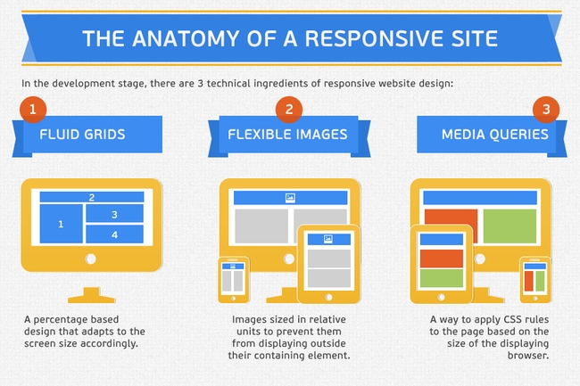
The Anatomy of a Responsive Site
But, when it comes to online marketing, what are the SEO benefits of going responsive? Here’s how responsive web design can help a site to shine in the SERPs.
#1. Utilizability:
The search giant Google always wants to send it’s searchers to the websites which are useful for them and relevant for their search term. When visitors browse through your website and immediately return to the SERPs, at this point Google makes a note that your site may/might not be relevant for that search term which the visitor typed to get into your site.
- According to Gomez research in 2012, 46% of consumers are unlikely to return to a mobile site if it didn’t work properly during their last visit.
- If your site isn’t mobile friendly at all, 61% of your visitors will return to Google to find a site that is easily readable (Karim Temsamani at IABALM 2012).
This will result in increased bounce rate and ranking drop in mobile search. The responsive web designing process allows the websites to be absolutely compatible with all the devices through which you can access the internet.
#2. Duplicate Content:
Having a mobile responsive website gives you a peace of mind that your site won’t be hit by Panda for having the same content in both desktop, tab or mobile version . In responsive website designing technique, the content is served to the visitors from the same URL in any devices.
#3. Mobile Search Ranking:
As per the new mobile ranking strategy designed by Google – it gives special preferences to the sites which are compatible with all devices such as desktop, tablet, mobile etc.
#4. Link Building:
With mobile friendly website design when someone links to your main site he apparently links to the mobile version of the website as well. A visitor can easily connect to the main web page from the mobile version website by just clicking on the link which would be provided by the mobile website version. The actually helps (in your search engine optimization) to flow all the link juice to one URL and also provides a brilliant user experience to every visitor.
#5. Local Search:
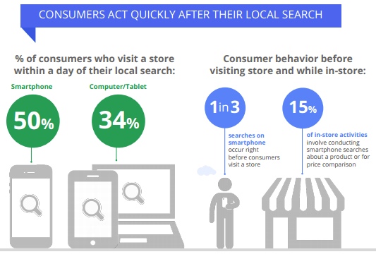
Consumer in-store behavior (Study By Google)
Unlike desktop searches, experts believe local search to be an essential factor of mobile searches on a smartphone. Yes I agree, not all the local searches goes for online shopping. But some do call them directly from the mobile SERPs to do the business. Google’s new study shows local searches lead 50% of mobile users to visit stores.
#6. Bounce Rate:
If your site isn’t mobile-friendly them it might suffer from high bounce rate issues for mobile searches. More the bounce rate, more are the chances for the website to have a negative ranking effect. Therefore, if there is a good set of correlation between the desktop version and the mobile version of the website, you can easily expect a good rank of your web page. Here are some additional tips to decrease your bounce rate.
#7. URL Structure:
A great responsive site is typically competent of providing the frequent viewing needs of the website visitors devoid of changing the main URL. As Matt Cutts said:
Responsive design just means that the page works totally fine whether you access for site URL with a desktop browser or whether you access that URL with mobile browser,” Cutts said. “Things will rescale, the page size will be taken into account.”
“In general, I wouldn’t worry about a site that is using responsive design losing SEO benefits because by definition you’ve got the same URL,” Cutts said. “So in theory, if you do a mobile version of the site, if you don’t handle that well and you don’t do the and all those sorts of things, then you might, in theory, divide the PageRank between those two pages. But if you have responsive design then everything is handled from one URL, so the Page Rank doesn’t get divided, everything works fine.
Here is some additional read on SEO friendly URL structure.
If you already have a mobile website then consider converting that to a responsive design so that it’s optimized for all other devices. But before you start doing that, there are quite a few aspects that need to be taken care of in order to ensure that your visitors get the same design, content of your website in whatsoever platform he wishes to check it.
You need to be very careful concerning the technical implementation which is very advanced and countless small faults have to be avoided. The following methods can be taken into consideration:
1) Using optimized images:
While designing a website, you should be utilizing optimized images which can be easily loaded on all the devices from desktop, tablet & mobile version of the site. According to research by Gomez.
- 74% of mobile users will leave after 5 seconds waiting for a page to load.
- 71% of mobile browsers expect web pages to load almost as quickly or faster as web pages on their desktop computers.
So make sure that you compress your images as much as possible. There are plenty of software’ which are available on the web with the help of which you can easily compress or compact the various images. Yahoo Smush it is one of the most common software which is used as a compacting image tool.
If you are more concerned about speeding up your website, then here are 11 best ways you can do that.
2) Screen size oriented designing:
With the aid of responsive web designing, you won’t have to design different web pages for the different screen sizes. Once designed, it would automatically adjust itself to provide the best viewing option to the visitors. As designer Stephen Hay says:
Start with the screen small first, then expand until it looks like sh*t. Time to insert a breakpoint!
3) Keeping the contents intact:
The mobile friendly website designs also keep the content intact for all its versions in different devices. The only difference which you might see is in the advertisement part (which users probably didn’t want in the first place) and a bit of difference would be experienced in the navigation part,(which is replaced by a simpler version of navigation) apart from that everything is kept intact. It is always advised not to alter the content of the website on even any lighter edition of the web page.
4) Touch optimization:
It is an important aspect to design the website with complete touch optimization as nowadays every device – from a personal computer to a smart watch, every device comes with a touch screen, so it is always advised to design the website with complete touch optimization. But beware of the fact that you can’t hover with the mouse in most of the smart devices such as mobile, tablet or smart watches which you can easily do on your PC or laptop.
5) Should be tested on all browsers:
It is a mandatory thing that the web page needs to be tested in each and every browser. Here are the browsers you’ve got.
For Desktop: IE, Firefox, Chrome, Safari
For Tablet/Mobile: Safari, Default Android browser, Chrome beta, Dolphin, Opera, Firefox
So, is it Worth it?
The responsive web design will allow the web page owner to pull the modern web users through the smart devices and will help him or her to be a step ahead of his worthy competitors.
Have you already switched to a responsive web design? Any advice for those who haven’t?

 8420
8420 info@webaholic.co.in
September 15, 2014
Hi Saha,
It’s an informative post.:)
We all know that design of any blog is really important.
Not only from the SEO point of you but also from readers. Your readers want to visit the blog which can attract them.
You need to take care about the widgets, your header and many more things.
Google bots also prefer the website with great CSS. Design matter them for a lot. Google shows the websites to it’s viewers which are best in their field.
Great post indeed.
Have a wonderful week ahead.:)
~Ravi
September 16, 2014
Thanks Ravi for stopping by. Glad you liked this article 🙂
I absolutely agree with you it’s all about making your site better for your readers. It’s UX that matters the most.
Hope to see you around.
September 16, 2014
Hello Saha,
Informative Post 🙂 As we know Responsive webdesign means that the website is designed for mobile users.
A responsive web site design makes it easier for your readers or visitor to see view of your blog/website from their tablet or smartphone and responsive design have one URL and the same HTMLs so it’s more easier for search engines to crawl and index.
Thanks for sharing this informative post with us.
Have a great day !
Regards,
Minakshi Srivastava
September 16, 2014
Thanks Minakshi! Glad you enjoyed this post 🙂
You pointed it out correctly RWD makes life easier for everyone 🙂 For the users who visit your site from a mobile or tablet, you don’t have to add a bunch of extra codes for redirecting smartphone users to the mobile version or spend money on creating an app.
Hope to see you around.
September 17, 2014
Hi Saha,
It is an informative post indeed!
You are right, Website design is very very important thing in blogging for both user and search engine
As you describe about responsive design. It’s good for seo and the reason, I am using Responsive WordPress theme for my 3 sites.
Any way thanks for sharing
Areeshsa Noor
September 19, 2014
Hey Areesha, so glad that you enjoyed this post!
Surely UX is one of the most important factor as Derek Halpern pointed it out right that “Design is the King” backed up by research.
It great that you are using responsive theme an your blogs!
Hope to see you around 🙂
September 19, 2014
Hi Saha,
What a great informative post! I learned the hard way that I needed a responsive web design. Months ago I was going with a blog that was 4 years old…so was the theme. Now you can just imagine how slow and inefficient that was.
It was not until someone pointed out to me that they couldn’t read it well on their phone that I had to make a move fast. I hired someone to do my entire blog so that the theme worked, the load time was fast, and it was compatible on phones.
It was a lesson I’ll never forget!
-Donna
September 19, 2014
Thank you soo much Donna for sharing your experience with us. I guess this must help those people who are still undecided to go for RWD or not.
Glad you liked this post 🙂 Hope to see you around!
October 29, 2014
SEO and PPC are two individual processes that have overlapping topics such as design and usability, navigability and content. When these topics are dressed in a combine manner, a stronger and more complete marketing method is born.
Overall, the field of search engine marketing is enhanced when the key processes of SEO and PPC work hand-in-hand to create a stronger form of search engine marketing.
Well done saha !
October 30, 2014
Thanks Tia for your valuable inputs! Glad you enjoyed the post 🙂
November 14, 2014
Hello Saha,
This post is very impressive. Responsive website is the current trend in web design and also more favored by people. Responsive sites are also Google friendly hence the SEO becomes good for it.
November 15, 2014
Thanks Steve! Glad you liked the article 🙂
November 17, 2014
Hi Saha,
i think smartphone users are increasing day by day and to stay in market with online business it is must to have mobile website and responsive website will reduce the cost of new mobil website. thanks for the nice explanation i enjoyed reading it
November 17, 2014
Thanks Rabia! Glad you enjoyed the article 🙂 Let me know if I can help you with anything.
December 16, 2014
Thanks for this article! Responsive design is necessary nowadays ! Because People are using their Smartphones and Tabs rather than laptop and PCs !
December 17, 2014
Thanks Rohan! Glad you liked this post 🙂
December 20, 2014
I know the importance of responsive design because I lost lot of traffic when using simple theme. You wrote really a nice post here. Thanks for discussing here.
January 7, 2015
Saha you nailed it! really helpful for the SEOs.
Being an SEO expert even i believe that responsive website are SEO Friendly . good going !
January 9, 2015
You said truly right because it runs and opens properly on mobile. If we don’t use responsive then lose mobile traffic. This is very nice and informative post.
May 7, 2015
Usability and local rank are the main factors according to me.
September 30, 2015
yes you are right Saha, Now a days its really important to have a responsive web site. Not only for SEO wise, as because technologies improving day by day and screen resolutions changes every time.
October 24, 2015
Responsive Websites are necessary for long time, as a business way one of the efficient to make a responsive website than to get positive result and more traffic on that website.
Thanks for sharing and great article or enjoyed to reading this article to much.
November 10, 2015
Hi Saha
After reading this complete article, I would must say that you rocked this article. 😀
You had covered all the major things in this article and made it helpful.
From last few days, I had reading some of your articles and I found that you are putting more efforts in your articles and trying your best to serve better content.
That’s really good for your blog. 😀
I would also suggest you to focus on building genuine email subscribers on your blog. Try to add links to subcribe to your newsletter in the middle of your post.
This will boost your email list.
Either way, keep up the awesome work with your blog.
Have a nice weekend. 😀
December 5, 2015
Responsive Website Design puts too much focus on mobile users while ignoring the fact that it may inconvenience desktop users. Regardless though, the mobile market is growing steadily, and more and more people are owning smart phones, which is why most webmasters need to play their cards right.
Thanks for shared an impressive and interesting information or enjoyed to read!
January 8, 2016
Hi Saha
I just loved reading your articles. 😀
The best thing which I really like about your articles is, you covers each and every thing in your articles which makes your article more helpful.
I have seen people love to read those articles more which are easy to understand and can help a lot. And you always write such kind of articles.
I would also like to suggest you one thing.
You should try to keep your paragraphs short so that people can’t scare before reading that paragraphs.
Short and cute paragraphs increase interest of the reader to read the complete article.
I hope you wouldn’t mind my suggestion. 😀
Either way, Thanks for this wonderful article. 😀
February 9, 2016
Every one wants to know the benefit of any new change, especially for their industry. After reading this post, we can get conclusion that, the Responsive design will help in content duplicity issue for most. Also you don’t have to do separate promotion for mobile site and desktop site. Even Google will give special preference to mobile friendly responsive website in their mobile search. So, at the end, Responsive design is really beneficial.
February 25, 2016
I am a big fan of responsive not only for SEO but also for the cost. You don’t have to design and pay for multiple versions of your site. Granted there are times she a mobile site is required however for most personal and small business sites responsive makes the most sense.
Thanks for getting more information, thanks for shared and enjoyed to reading this post.
March 9, 2016
Hi Saha!
Great article! Thank’s for sharing!
Without the mobile version of the site it is really very difficult to get a good positions in Google.
August 27, 2016
Hi Saha, you wrote a very nice aritlce, without mobile friendly website means no traffic no earning, Thank you very much