When it comes to generate free advertising, social sharing buttons are no doubt one of the best ways to spread the words out via different social media channels. Many internet marketers will suggest you to add social sharing buttons to increase traffic. They might also agree that it will work as an element of social proof but not everyone agrees on how many social sharing buttons you should have.
Though social sharing buttons helps you to generate tons of traffic but it’s not always good for user experience.
Each social sharing button uses a piece of JavaScript code to make calls back and forth between the social network’s servers and your site. And if you are in WordPress using social sharing plugins then it also needs to load additional JavaScript files from an external source which is from the plugin supplier. So, the more buttons on your page, the more script the page needs to load. Ultimately which leads to longer page load time.
Page load speed should be a major concern for your website or blog because it has a direct effect on user experience and your website’s search engine rankings. According to a study by Akamai and Forrester Research, nearly half of web users expect a site to load in 2 seconds or less, and they tend to abandon a site that isn’t loaded within 3 seconds. Site speed is so important that even Google has included it as a ranking signal back in 2010.
Too Many Options Can Lead To Decision Paralysis
Those who are interested in the psychology of choice tend to reference Sheena Iyengar’s 1995 “jam study”. The Columbia University professor, Sheena Iyengar set up a free jam tasting booth in California Draeger’s supermarket—an upscale grocery store called Wilkin & Sons Jams, known for an extensive product selection — on two consecutive Saturdays.
On one Saturday, she offered 24 flavors of jam, and on the other, 6 were available.
Now can you guess which display jams sold more?
When 24 jams were available, 60% of the customers stopped by, took the taste test and 3% of those bought some. And when 6 jams were available, 40% of the customers stopped by, took the taste test, but surprisingly 30% bought some.
Huge results. While the larger display attracted more people, the smaller display sold more jam. About 6 times more.
So what this test mean to you?
This boils down to one simple thing that “more isn’t always better” i.e. more social sharing button doesn’t always guarantee you more social shares.
Neil Patel also did a study on social sharing buttons. On his blog Quicksprout he generally has 3 social sharing buttons: Facebook, Twitter & Google+. Now to increase his total number of shares per post he added LinkedIn and Pinterest. But ultimately the additional social sharing buttons decreased overall shares by 29%.
This above case study also shows that your social sharing buttons are like mini calls-to-action; too many choices may confuse your readers into not sharing anything at all.
Content with Zero Social Shares Looks Unpopular
Neil’s study mainly focuses on blogs. But what about other websites? Such as landing pages or product pages and so on. So should you put social sharing buttons everywhere?
A/B Testing with Social Sharing Buttons
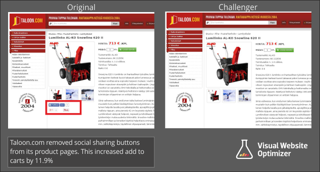
Taloon.com, a Finland-based hardware eCommerce store also managed to lift up their conversion rate by 11.9% just by removing the social sharing buttons from their product page. Read the full case study by Visual Website Optimizer here.
The above case study focuses on to two main factors:
- Lack of Social Proof: According to Taloon the total number of shares on most of their product pages were zero. Here the zero or low social shares conveyed distrust about the company and the quality of it’s product. It takes two clicks to share a content through sharing buttons and if the page has zero shares then, it’s telling visitors the page isn’t worth two clicks. That doesn’t mean it’s no good, but sometimes perception is everything. As Neil Patel says “Social proof isn’t always the best proof – you would think that social proof helps boost conversion rates, but it doesn’t always work that way,”
- Distraction from the main goal: Though Taloon was using prominent Call-To-Actions, but it was clear that the social buttons acted as a distraction from the main goal of the page. As Angie Schottmuller says “One Page. One Purpose. Period.”
How Pro’s Are Using It?
Social Sharing Buttons on News Sites and Blogs
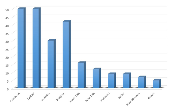
We’ve gone through top 50 news & internet marketing blogs and Facebook, Twitter, Google+ came out to be the most used social sharing buttons followed by LinkedIn. But on the other hand news sites tend to give more genuine options to it’s visitors with “Email This” and “Print This” facility. Pinterest, Buffer are most used by blogs.
How Visitors Interacts with The Share Buttons?
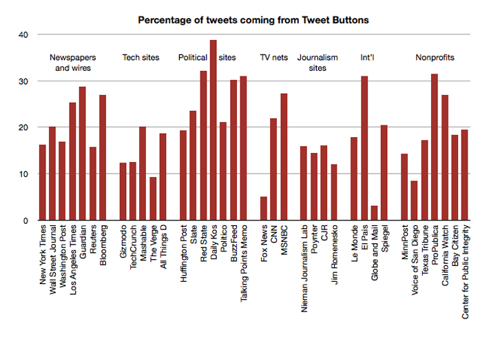
Have you ever thought how many people actually click the tweet button in your website/blog? Joshua Benton from the Nieman Journalism Lab ran some numbers to figure out if social sharing buttons do any good to the publishers.
Study by Joshua Benton, via Nieman Journalism Lab
On an average, media sites receive over 15% of their tweet mentions from the tweet buttons embedded in their site, which drags a ton of traffic.
TrackMaven have also done some research and found that when it comes to sharing blog posts, the vast majority of social shares come from Facebook and Twitter.
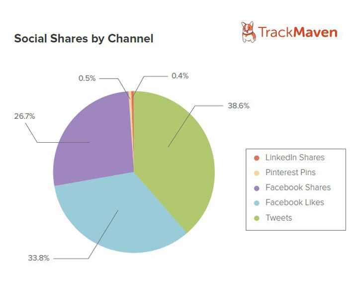
Social Shares by Channel
They have examined nearly 2 billion social shares out of which 38.6% of social shares were on Twitter, and Facebook “likes” was responsible for 33.8%. This data might not surprise you, considering that Facebook and Twitter holds the title of highest user counts – Facebook has 1 billion active users, and Twitter has 560 million.
TrackMaven also found out that readers were more likely to “like” a blog post on Facebook rather than sharing “share” it (It doesn’t mean Facebook shares are dead…it is still accountable for a whopping 26.7% social shares).
But even though LinkedIn and Pinterest both are not doing that good in the social sharing game, TrackMaven noticed that these are still important social networks for marketers. With 240 million active users LinkedIn isn’t that bad and holds a particular niche audience for the B2B marketers. Although Pinterest was found responsible for only 0.4% of total shares, it’s is still a powerful network for consumer and B2B marketers alike – according to a recent report from Connexity, 69% of online consumers who are on Pinterest found an item they’ve purchased or wanted to purchase compared to only 40% of online consumers who visit Facebook.
So Which Social Share Buttons Should You Include?
If you’re not too sure about how many social sharing buttons or which social sharing buttons you should have which will maximize your social sharing. Then first you need to start by diving into your Google Analytics referral traffic and audience demographics data.
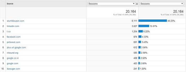
Google Analytics Referral Traffic Data
The Referral traffic data will show you from where are your visitors coming from on a consistent basis (exclude the one-hit wonder outliers). From the demographics data you will come to know which networks are your users playground or where they more likely to be on (more women are on Pinterest, B2B professionals are on LinkedIn, etc.).
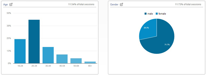
Google Analytics Audience Demographics Data
Now if you see your visitors are coming from a particular network where you’re not present or less active then you should be more prominent and active on that network. And if you are already present and rolling in that particular network then you should probably start thinking of doubling your activity. Ultimately you have to be where your readers are and you have to provide them the social sharing buttons which is right for them, without confusing them with too many options which will lead to not sharing at all.
So don’t just add whatever’s offered to you in the plugin. Choose your buttons wisely. Test, optimize and make sure you make those buttons work for you.
Control How Your Content is Shared
Have you ever been on a site where you clicked the share button and you had to go through all the unrelated images until you find the perfect image associated with the article? Remember that irritating moment and don’t let the same happen to your audience. Have complete control over how your content gets shared through Facebook’s Open Graph Protocol, Twitter Cards and Pinterest Rich Pins. These Meta tag options let you to control and optimize how your content appears in a user’s feed or timeline.
Focus on Button Customization
Another integral part of social media sharing button optimization is to make sure each plugin or button is customized to best fit your site.
Button variables to test might include:
- Width and height (Default style or Mashable/Upworthy style)
- Color (Your website theme color or not)
- Text (Default or “Share of Facebook” etc.)
- Format or shape (Square, circular, rectangular etc.)
- Visible share counts / no share counts
Customizing these options can make the social sharing buttons more noticeable or accessible, leading to greater user interaction and more social shares. Here is a helpful guide from Social Media Examiner to customize social share buttons for increased web traffic.
There are plenty of factors that shows how many social interactions your website will get. So, before you make any huge changes to your website/blog, first establish a goal and then test your results.
So, what social media buttons do you use on your website? Which social networks did work well for you? Leave your thoughts and suggestions in the comments section below – would love to hear from you.


May 6, 2014
That was an interesting read. The stats and the figures threw more light into the matter. As described in the article, lack of use of social sharing buttons is not recommended at all! It is more like avoiding social media sharing concept altogether.
At the same time, using so many buttons here and there on the blog post will confuse the users for sure. Besides that, it will also have serious impact on the performance and loading speed.
Nice to see which buttons are the pros using. Also, the pie chart depicting the share by channel thing was also beneficial. Luckily, I too have been using the sharing buttons of the biggie social networking sites on my blogs.
I found the link to this article on Kingged.
Arun
May 7, 2014
Thank you so much for your comment! Glad you enjoyed this article 🙂
Well the idea behind lesser sharing buttons too many choices confuses readers. But there are example that people are suing it with great success such as Jeff Bullas – It totally depends how your visitors are absorbing it!
Nice that you found this link on Kingged. Hope to see you around!
May 9, 2014
Hi Saha,
Cool study. Look at your goals. Sometimes easing up on share buttons improves the bottom line, while other cases require some button tweaking.
Thanks!
RB
May 11, 2014
Thanks Ryan! Glad you liked this post 🙂
Yes, I do agree with you on button tweaking. Some cases they really works take a look at Upworthy, Mashable, Viral Nova the use these sharing buttons as an additional Call-To-Action button. Which sometimes works like a magic.
August 3, 2014
Hi, May i know how did u added that big social share button at the bottom of the article. please let me know. thank you.
August 7, 2014
Hey Sandeep! that button was custom designed by our designer. But you can have kinda similar look with a WordPress plugin called “Share Button Mashshare”.
February 25, 2016
Great work here Saha! I’ve just been researching an article I’m writing for our blog (on the Paradox of Choice) and came across this. It’s perfect! Will definitely be linking to and quoting you in our article when it’s published.
And I can’t agree more about the customization aspect– and we’ve got some great proof. Since every social network has its own culture and “terms of engagement” so-to-speak, customizing the shares for those networks is crucial. That’s why one of our most effective features is the ability to customize the image and description of the pin when someone clicks the “Pin” button. It’s led to a 2,000% increase of Pinterest traffic on my personal blog.
October 3, 2016
Have you ever thought about publishing an ebook or guest authoring on other sites?
I have a blog centered on the same topics you discuss and
would love to have you share some stories/information. I know my readers would
enjoy your work. If you’re even remotely interested,
feel free to shoot me an email.
August 10, 2017
Your post always motivates new bloggers like us. I have been following your blog since 4 month and now applying each and every method suggested here. Its really improving my results.
And thanks for all the guides with simple language.