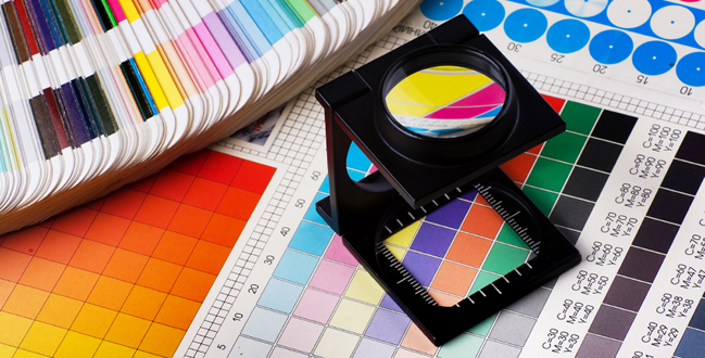
The colour of a web page goes far beyond simply the graphic designer’s favorite colour or the shade they had in their head when they sat down at the computer – just like the words and images on a page, colour is a highly effective and all too often neglected medium to influence your website visitors.
With this in mind, it’s important to know what each colour is associated with and the effects these colours have; I’ve seen countless websites which structure themselves brilliantly but really fall down visually – and this almost always resorts in the little ‘x’ in the top corner of the browser. To avoid this happening to you, here’s a list of colours to refer to.
Red :
The colour of energy, passion, love, danger and anger. The use of red on a webpage is hugely context-specific; if you’re hosting a website selling Valentines Day gifts then red can be a perfect choice, but if you’re trying to portray a calm, confident business then it might be best avoided. It’s worth noting that red has been proven to increase heart rate – and you’ll want to be very careful about doing this to your audience.
Orange :
Joy, change, aggression and most importantly a call to action. Orange is a friendlier tone than red but nonetheless somewhat too aggressive to plaster everywhere. That said though, its interesting mix of properties make it a very effective call to action – ever noticed how a lot of top eCommerce websites have the ‘add to basket’ or ‘pay now’ buttons in orange? Use it sparingly and use it where it counts.
Yellow :
Stands for optimism, hope and happiness. A great colour to make your website look cheerful but something of a double-edged sword – just like that person who’s too happy all the time, too much yellow can end up being agitating and drive people away. It’s also got a variety of sometimes contrasting meanings across different cultures, and for this reason it’s not an advisable choice for a lot of websites.
Blue :
Trust, security and responsibility – all the properties you want your business to be associated with. This is exactly why you see so many websites formatted in (dark) blue. Remember that a light blue can also create a friendly tone and might help you stand out a little bit.
Green :
The colour of wealth and renewal, as well as being the easiest colour on the eyes. Green is a fantastic colour to incorporate but is also very dependent on shade – if you’re selling health/environmentally friendly products then a light green is much more suited than a dark one.
Purple :
Associated with royalty, creativity and wisdom. These all seem like fantastic descriptions for any website, but for one reason or another purple is famously difficult to incorporate in an aesthetically pleasing page. If you’re particularly good with colour (or know someone who is) then it’s worth experimenting with.
Pink :
An interesting fact about pink is that sports teams used to paint the opposing team’s lockers in this colour to calm them. With that in mind, it’s fantastic if you’re looking for a calming web page or one which evokes femininity. Whilst pink is becoming a much more gender-neutral colour, it’s unwise to use it somewhere with a largely male audience.
White :
The colour of purity and minimalism which will work with just about any other. You’d be hard-pushed to find a website which doesn’t utilize white in some form, but many designers fall down by relying on it too much and thus creating an impression of emptiness and blandness.
Black :
Denotes elegance, prestige and classiness. Despite being the opposite to white the two colours share a lot of the same properties; again black can be paired with just about anything, but it will look bland and foreboding if it’s splashed about everywhere.
A final thing to remember
The point of using an effective colour scheme isn’t just to get your visitors to hit the ‘buy now’ button this one time – it’s to get them coming back and remembering you above your competitors. With that in mind, it’s important to decide on a colour scheme and stick to it; whatever advertising media you produce, try to incorporate the main colours you’ve chosen for your website. Do your research on your competitors and then spend some time developing a unique and appealing colour palette – you’ll be surprised at the impact it has.
Opinions expressed in the article are those of the guest author and may not reflect the views of Webaholic.
Rob writes for Vision Media – a leading digital marketing agency.

